Mobile design for Asp.NET WebForms: Telerik UI for ASP.NET AJAX offers now an alternative to Twitter Bootstrap
We are in the age of seamless connections, where smartphones long surpassed regular cell phones use, where tablets sales skyrocketed and where mobile devices generate more web browsing than any existing technology. People all over the globe use all sorts of handsets to navigate the web, to work or just leisure. It is estimated that this year, over 79% of the Internet users will go online via mobile handsets at least once per month, which compared to 2013 has increased from a 73.4% figure.
Also until 2017 most regions will report penetrations rates of around 90% range, a figure that should be reachable considering actual evolution.
What does responsive web design mean?
A great illustration belonging to Stephanie Walter states that web content should be like water. When you put water into a cup takes the shape of the cup, but when you put water into a bottle, takes the shape of the bottle, so the concept of responsive web design suggests that the appearance of the project needs to adapt to the media that renders it. In other words website’s content should make an efficient use of the available space on the screen. In addition the websites’ content has to be easily readable and fit perfectly on any device.
A website designed with Responsive Web Design is able to adapt its layout to user’s viewing environment by using fluid and flexible images or grids.
One of the most frequent solution for developing responsive web designs is Bootstrap, which enabled fast and easy web development for millions of websites across the web.
Twitter Bootstrap is an adaptable technology enabling developers to select the components they wish to use in their projects. It consists in a series of LESS stylesheets that apply different components of the toolkit making it modular and compatible with the latest versions of browsers.
With Bootstrap, users get extensive and great documentation with tones of live examples, code snippets, and more.
Additional UI elements are provided like dialog boxes, tooltips, and carousels, as Bootstrap comes with several JavaScript components in the form of jQuery plugins. With the release of the toolkit’s 2.0 version, it supports responsive design, enabling web pages layouts to dynamically adjust, taking in to consideration the attribute of the device used: desktop, laptop, mobile phone or tablet.
Telerik UI for ASP.NET AJAX offer an alternative to Bootstrap for Asp.NET developers
The alternative comes in handy. Unlike other layout frameworks like Bootstrap, developers are now able to configure the layout of the page (RadPageLayout) totally on the server side.
Telerik UI for ASP.NET AJAX makes your ASP.NET sites or applications responsive allowing developers to rearrange and hide page elements to deliver content crafted to the needed screen size using media queries to get details about the end-user dimensions. Recent mobile trends delivers a great impact to the modern web development, creating applications and websites that work great both on mobile and desktop.
The package offers support for fixed and fluid layouts and horizontal stripe design and new controls such as: responsive capabilities in TitleList, elastic capabilities in Button, Dock, Form Decorator, Image Gallery, Notification, Social Share, ToolTip, Window and none of the less adaptive capabilities in Scheduler and Menu and many more. A new Menu, AutoCompleteBox, Calendar, CloudUpload, ComboBox, DropDownList, MediaPlayer etc
Telerik Ajax menu changes to create user experience fit perfectly to the device screen, when got accessed via a mobile device. Support for touch on mobile stands as one of the most important directions to develop UI for ASP.NET AJAX, so the first quarter of 2014 brings user experience able to fit to any device.
Telerik has introduced eponymous mobile render-mode as even improved lightweight rendering can fall short of being appropriate for mobile. The scripts, styles and rendering are designed to offer mobile a first-class experience, as this is not just extension of the classic or lightweight rendering.
The company has managed a way to look in the future, thinking about usability, flexibility and spacing for devices that are yet to be released.
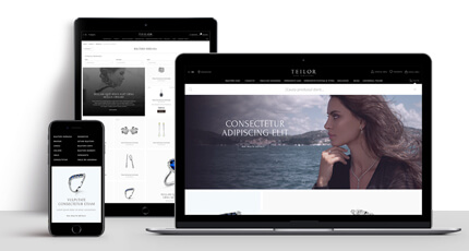
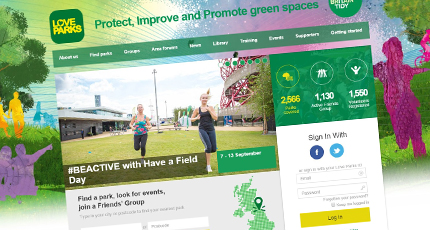
Here at Roweb, we developed and worked on a series of projects that used technologies such as Bootstrap for creating responsive design websites. Bootstrap was our first option in creating such websites and have used it with success for a wide variety of clients, offering custom solutions for tangible needs. Here are some responsive design websites built using Bootstrap: A2C , EIC , Bijuteria Teilor
The new capabilities and controls from Telerik UI for ASP.NET AJAX stand as a feasible alternative to Bootstrap for ASP.NET developers. Long back we have used Telerik UI controls in our projects as it allows fast build and provides rich and powerful interface. We are looking forward to see the new responsive features put to work and compare the final outcome with Bootstrap.


