Short comments about Bootstrap
Twitter’s Bootstrap framework, an amazing tool for front-end web development that since its release in mid 2010 has become one of the most popular open source projects in the world. Now developers have the proper tools to create web applications and responsive web pages as Bootstrap has a ‘responsive grid’ built which makes designs compatible with handsets browsers.
Bootstrap offers a solid foundation for developing full-featured, responsive web apps capable of working on array of platforms.
Earlier versions started with desktop clients and downgraded the interface for smaller, mobile clients but with the current 3.0 release Bootstrap has turned this approach by being mobile first. So depending on screen size, web pages developed with the actual Bootstrap version aim mobile devices and scale for bigger screens.
Bootstrap 3 offers tones of new features:
Panels
The framework is now supporting new features and classes. One of the numerous new features is the panel component which enables developers to place a panel of information on his project. This panel can include customer colors scheme, border and additionally there are classes for list groups and thumbnail images etc
Grid based
Latest Bootstrap version is using for presentation and layout a grid based system and contains 4 grid classes which target a variety of devices such as: handsets, desktops. This version is able to offer an improved flow and sizing and there are a lot of changes since previous Bootstrap 2 version.
Browser support
Now it is very easy to find information as the documentation for Bootstrap 3.0 has been updated and expanded. Bootstrap is no longer supporting Internet Explorer 7 and Firefox 3.6, also there are some problems regarding IE 8 through 10 and in the same instance with other browsers but the documentation contains details about how to make your sites work with these browsers.
Mobility first
By default Bootstrap is now responsive so at this point the responsive CSS are loaded all in the main bootstrap.css file. If by any chance you needed to develop a web page without a responsive layout it still can be done using .col-xs-, .col-sm-, .col-md-, .col-lg- and the responsive utility classes. This version of Bootstrap allows web page elements such as text, images, buttons, paragraphs to scale accordingly.
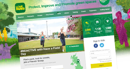
An important project built using the latest Bootstrap technology is the Keep Britain Tidy portal, also our online portal solution has made the transition towards Bootstrap 3.